Overview
Axtria is a Life Sciences-focused data analytics and cloud software company, and a products-led services partner. It works with 100+ clients, including 16 of the top 20 global pharma companies, across 70+ geographies. Its four products (SalesIQ, CustomerIQ, MarketingIQ, DataMAX) sit on one platform that turns data into decisions for commercial and clinical teams.
Categories
Client
Project
Disciplines
The Challenge
Axtria doesn’t sit neatly in one category. It’s a data analytics and cloud software company, a deep domain expert in Life Sciences, and a products company that shows up as a services partner. All three are true at once, and the brand had to hold them together without flattening any one.
The brief put it simply: a data analytics and cloud software company focused on Life Sciences, and a products-led services company. The open question: how to tell that story through design, not just copy.
The Approach
1. Landing on the idea of intersection
Rather than choosing one identity, the story was anchored where two domains meet. A blue arc stands for expertise in data analytics; a green arc for depth across Life Sciences. Where they cross, an orange point marks Axtria itself, drawn as a rhombus, the flowchart symbol for a decision point. It reads literally as what Axtria enables: sharper, faster decisions at the intersection of data and domain.
2. Exploring how to say it
Several routes were tested: split-screen “perspective” layouts that gave each side its own frame, and full-bleed statements that let one arc dominate before the other entered.
3. Grounding the concept in imagery
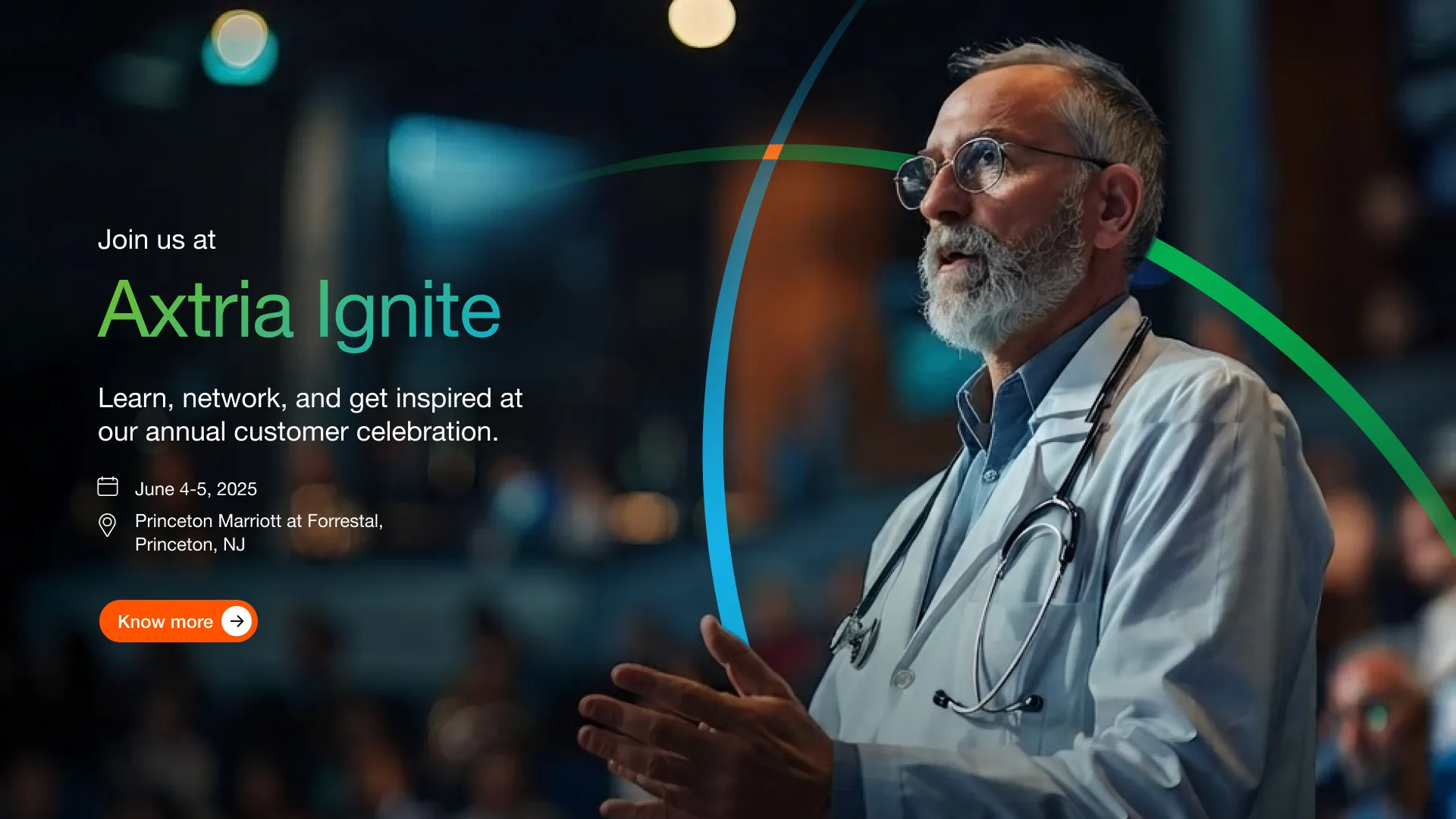
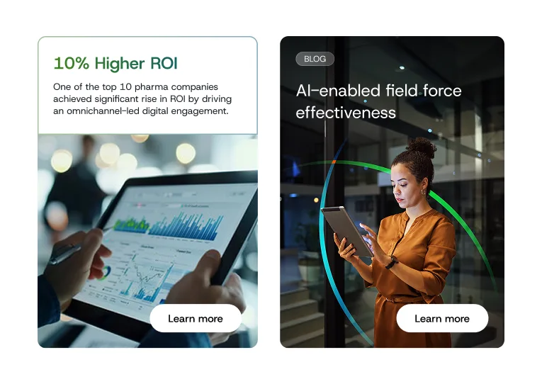
The imagery reinforced the idea at a human level: healthcare professionals at digital interfaces, alongside data streams and graphs. It tied medical expertise directly to analytics, AI, and machine learning, rather than treating them as separate visual worlds.
4. Refining it to a single mark
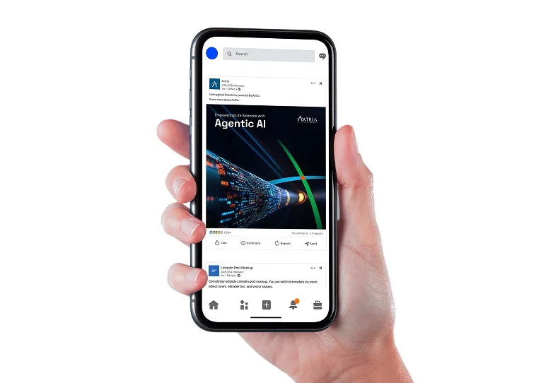
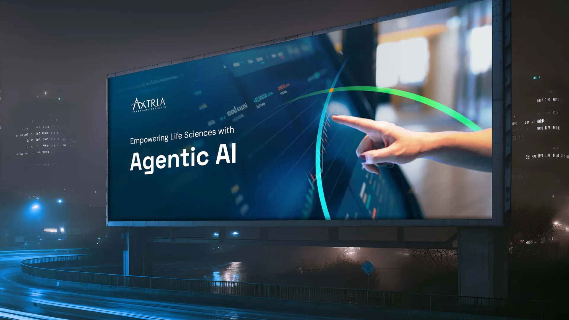
The explorations were pared back to one restrained motif: two arcs, blue and green, crossing at a single orange point. Simple enough to travel from the website hero to decks and internal collateral, while still carrying the full intersection story.
5. Carrying it into the website
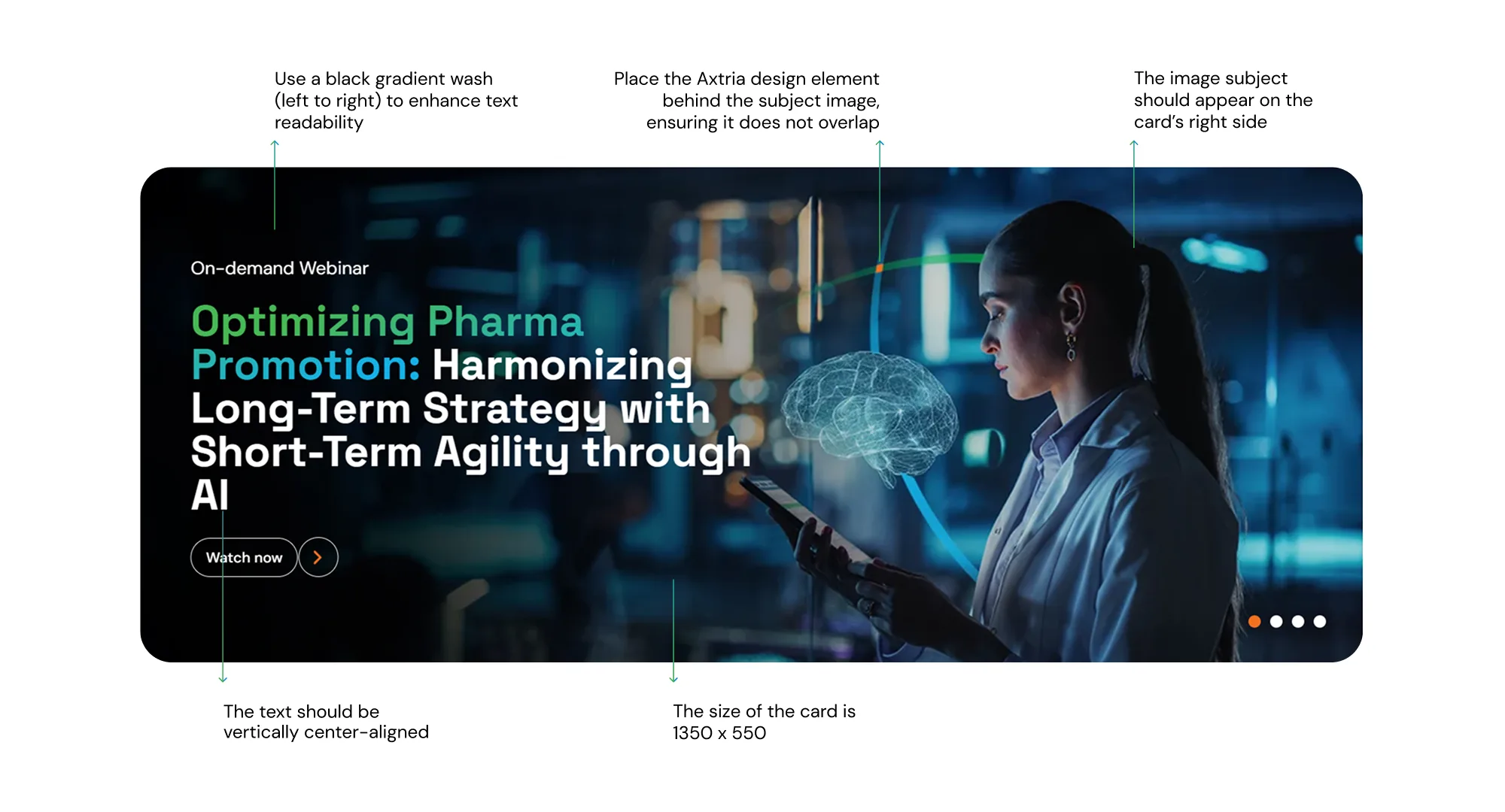
The motif shaped the website’s structure, from the hero and page transitions to section dividers and product pages (SalesIQ, CustomerIQ, MarketingIQ, DataMAX). The colour system carried over from the arcs, giving every surface a consistent anchor.
Perspective
Focusing on who we are
We are a data analytics and cloud software company focused on Life Sciences. And we are a products-led services company.
It implies we operate at the intersection of technology and Life Sciences, helping organizations solve key challenges with the right technology. And we deliver services through our products that accelerate time to value.
So, how can we tell this story through design?
We operate at the intersection of AI-driven Data Analytics and Life Sciences. This visual concept represents that intersection.
Blue line represents our expertise in Data Analytics, and the products and services that use it to deliver impact.
Green line represents our deep understanding of Life Sciences and our reach across its segments.
Rhombus, in an algorithm, marks the point of decision. That’s what we enable for customers: strategic, impactful decisions at the intersection of Data Analytics and Life Sciences.

Result
A brand system where the “intersection” isn’t just a metaphor in a deck. It’s a visual device reused across identity and website, making Axtria’s dual expertise legible at a glance.