Overview
Payoneer is a global payments platform serving freelancers, marketplaces, and businesses across 190+ countries. I chose it as a subject for understanding how product-based companies build trust visually at scale — not as a client brief, but as research-through-making: a self-directed study of branding language in the payments and fintech space.
Categories
Year
Client
Disciplines
Solution
What I set out to explore was how a product-based company — versus a service company like TerraPay — uses its website to communicate reliability, global reach, and ease-of-use simultaneously.
The process started by deconstructing Payoneer's existing brand cues, then rebuilding and reimagining the web experience to sharpen that language: what stays, what gets clarified, and what a more considered system would look like.
Visual Identity
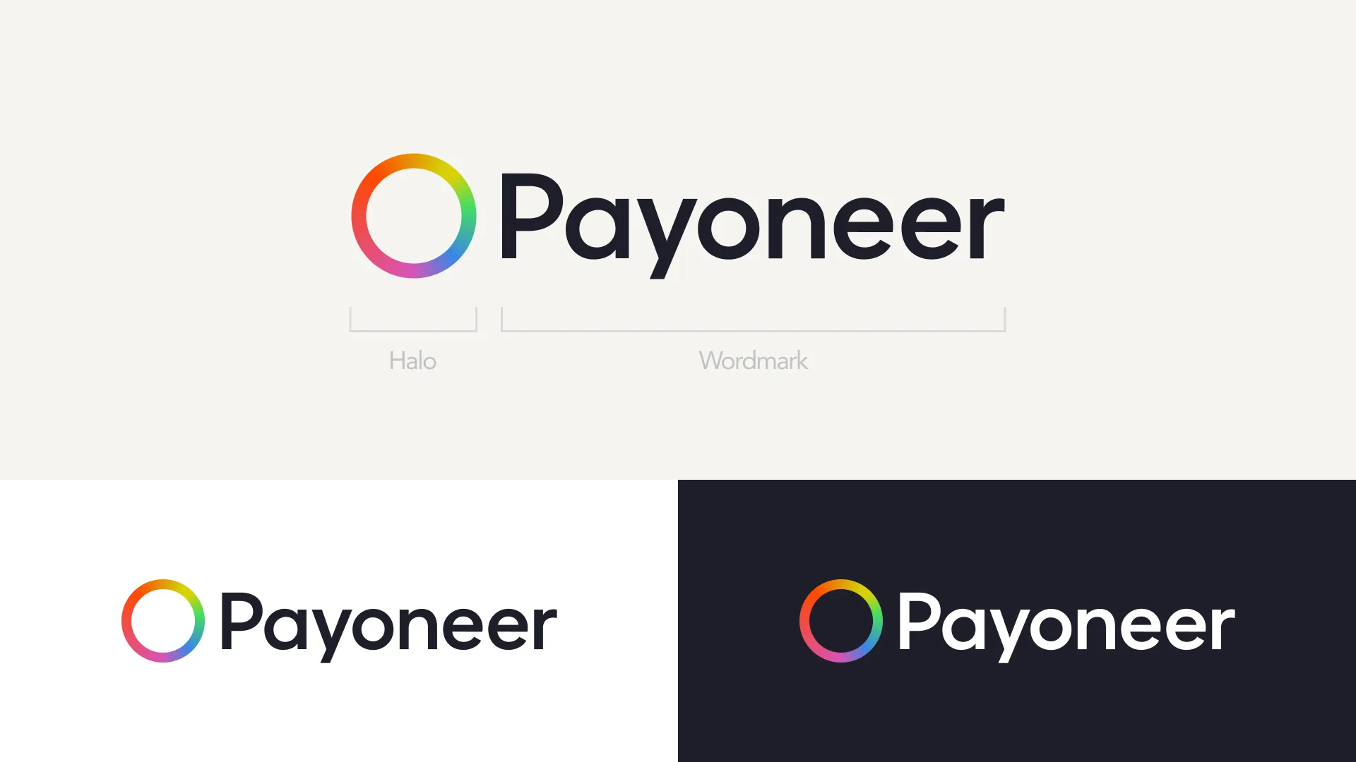
The exploration began by mapping how Payoneer's visual language works across touchpoints — logo, colour, type, iconography and motion — to see how a product-based fintech brand builds a consistent, reusable system. From that foundation came a reimagined set of components and standards for how the experience should look, feel and behave across every screen.
Colour palette & Typography
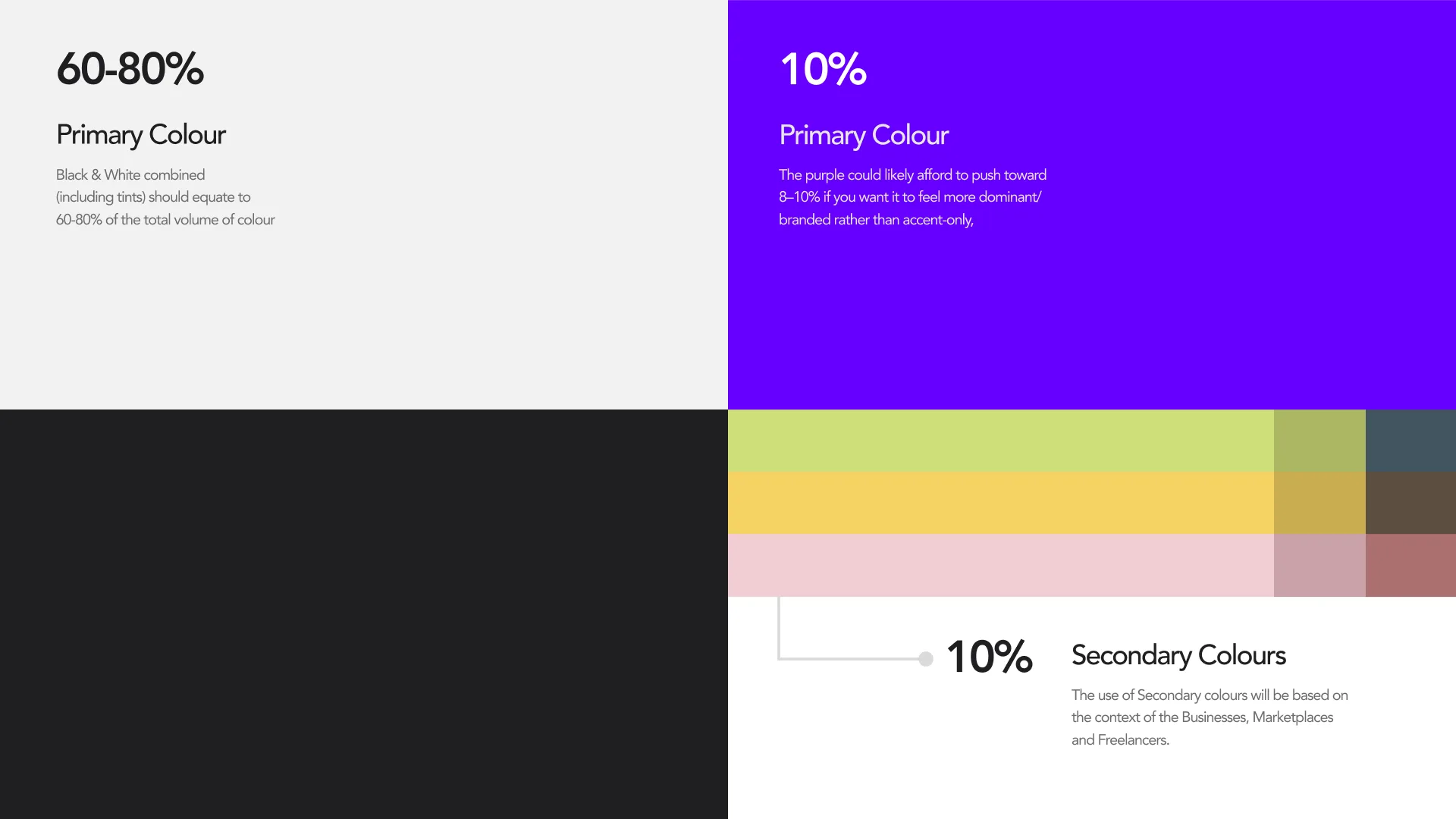
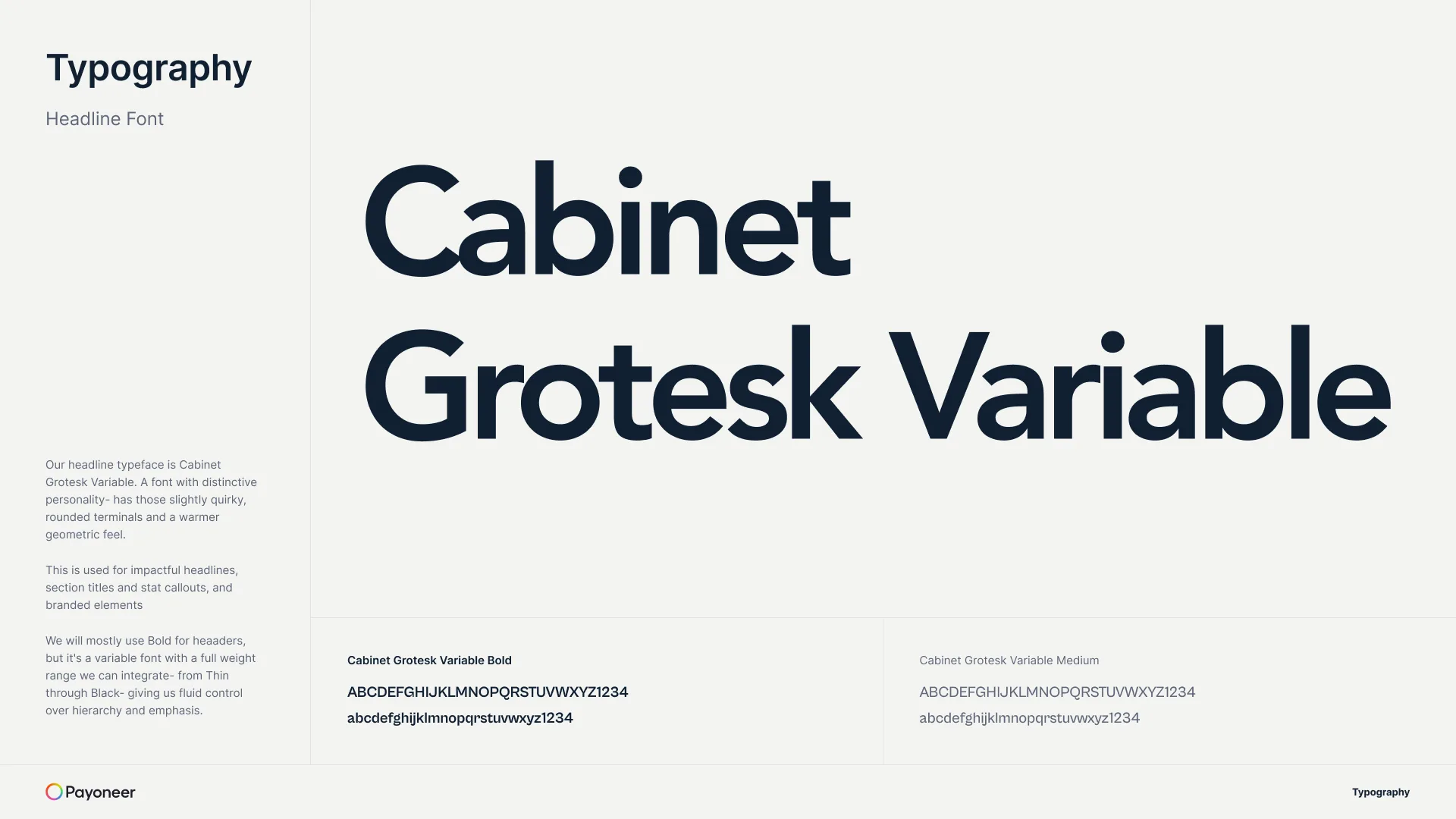
A palette anchored in deep navy/blue tones with a bright accent, paired with clean, versatile typefaces — a combination chosen to signal trust and accessibility at once.
Iconography
Payment- and currency-related icon language, simplified for global comprehension across markets, literacy levels, and device sizes.
Hero & motion
The hero section's animation and interaction style acts as the emotional entry point — the first few seconds that set the tone of "global, human, secure."
Design System
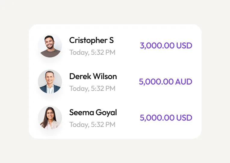
Reusable components studied and redesigned — buttons, cards, navigation, currency tickers, dashboards — documented across states and breakpoints, in the same format as the TerraPay system.
Grid system & spacing
Responsive grid logic carried across desktop, laptop and mobile, keeping alignment and rhythm consistent as content density changes.
Brand elements & imagery
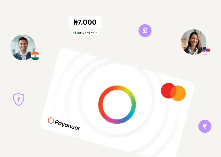
Photography and illustration style, abstract patterns, and treatment guidelines — how imagery reinforces a brand that feels global, human and secure.

Reflection
Since this was self-initiated, the takeaway matters more than an outcome. Studying Payoneer sharpened how I think about branding language in fintech and product companies: how a product-led brand has to earn trust through interface and repetition rather than through a relationship, the way a B2B service brand like TerraPay can.
It also clarified where product-brand thinking and B2B design-system thinking diverge — one optimises for a single confident first impression at scale, the other for consistency across many long-term partner touchpoints.