Overview
TerraPay is a global leader in secure, cross-border payment infrastructure, serving banks, fintechs, money transfer operators, travel companies, and digital wallets. At that scale, its digital experience had not kept pace. Fragmented interfaces, an inconsistent visual language, and complex flows created friction for B2B partners and the B2C users who depend on them.
The task was clear: unify the brand across platforms, simplify how global payments are understood and managed, and build a design system robust enough to scale with TerraPay's growth.
Categories
Year
Client
Disciplines
Solution
We ran extensive user research across TerraPay's diverse B2B customers, who operate in many countries and industries. It surfaced one common thread: users need clarity, trust, and control, not complexity.
From that foundation we built a comprehensive design system: one consistent visual language, reusable UI components, and clear standards for how TerraPay looks, feels, and behaves at every touchpoint.
Scale of Work
Design System
Components across 3 breakpoints
Brand Identity
Identity · Colour · Type · Imagery
Visual Identity
Every element, from logo to layout grid, simplifies the experience without diluting the sophistication TerraPay's B2B audience expects.
Logo
A refined mark with interlocking triangular cuts at the "T", a symbol of unity and connectivity. Clean lines and bold type anchor the brand in modernity and professionalism.
Colour palette & Typography
Deep navy accented with vibrant coral, evoking trust and dynamism. TT Firs Neue and Poppins pair modern sophistication with accessible communication.
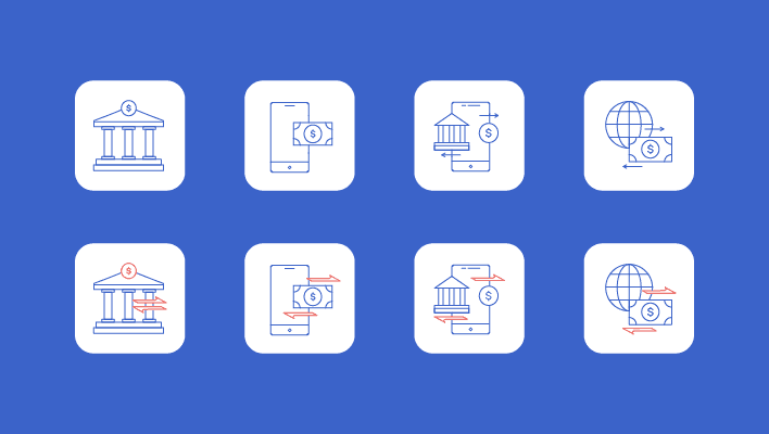
Iconography
A primary icon set built as an intuitive visual language, universally understood and consistent in style, bridging language barriers across a global user base.
Brand elements & imagery
Abstract minimal patterns, a defined photography style, and image treatment guidelines that create a cohesive, recognisable presence across every touchpoint.


Design System
A full library of reusable components, buttons, inputs, dropdowns, tabs, navigation, cards, and tickers, each documented across states, breakpoints, and interaction patterns. A responsive grid holds alignment across desktop, laptop, and mobile, with a spacing system that keeps the interface in visual harmony.
Component library
Reusable components documented across states, breakpoints, and interaction patterns, for consistency and speed across product and marketing surfaces.
Grid system & spacing
A flexible, responsive grid that aligns desktop, laptop, and mobile, with a defined spacing system that keeps visual harmony.

Result
The design system gives TerraPay a unified, scalable brand that stays consistent across platforms and partners. Resolving the inconsistencies that fragmented the journey improved how B2B customers navigate, trust, and adopt TerraPay, with those gains flowing through to faster, more reliable, more secure B2C payments.
It positions TerraPay as a brand as considered in its design as it is confident in its technology, built for global scale and for the humans navigating it.
10%
Faster design-to-dev handoff
3
Breakpoints unified in one system